Crosstabulation (also known as a crosstab or contingency table) is one of the first techniques junior analysts learn. But when studies require dozens of tables across demographic and behavioral variables, building, checking, and updating them quickly becomes time-consuming and tedious.
And yet, when analyzing survey data, crosstabs are precisely where some of the most valuable insights are hiding.
Crosstabulation is what transforms surface-level results into actionable understanding. It helps research teams understand how feedback differs across groups so they can make decisions based on how different audiences actually experience a product or service.
In this article, we walk through what crosstabulation is, how it works, when to use it, and how to apply it effectively in your research workflow.
What is Cross Tabulation Analysis in Research?
Cross-tabulation analysis, also known as contingency analysis, is a statistical method used to compare two or more variables in order to identify relationships between them.
For example, a skincare brand might look at customer satisfaction with a new moisturizer. When viewed overall, 80% of respondents reported being satisfied or very satisfied with the moisturizer, suggesting that overall sentiment toward the product is positive.
However, using a crosstab to compare satisfaction across age groups reveals a specific pattern: 76% of respondents aged 55+ reported being unsatisfied or very unsatisfied.
This dissatisfaction is less visible in the overall results because younger respondents make up a larger share of the total sample, demonstrating how overall results can obscure meaningful subgroup-level insights.
Who Uses Cross Tabulation?
Crosstabulation is used across a wide range of teams to understand how feedback and experiences differ between specific groups.
Market research teams
A market research team may use crosstabulation in the following ways:
- Compare brand perception across demographics
- Identify differences in feature feedback by user type
- Segment open-ended responses by satisfaction score
For example, imagine a food delivery company launches a new ad campaign focused on faster delivery times. At a topline level, brand perception may appear to improve overall.
But when the research team runs a crosstab comparing perception across subscription types, they may find that Free users respond positively to the messaging while Premium users remain neutral.
This is the risk of relying on topline results alone. The apparent overall lift is driven almost entirely by Free users, while Premium users, arguably the most valuable segment, show little to no positive response.
Without cross tabs, the team might conclude the campaign was broadly successful. With them, it becomes clear that the message needs to be re-examined and refined to better resonate with the highest-value audience.
Consumer insights teams
A consumer insights team may use crosstabs in the following ways:
- Analyze customer feedback by lifecycle stage
- Compare onboarding experiences across user personas
- Break down NPS verbatims by churn risk
For example, take a fitness app that notices a drop in user retention after the first month. When the insights team runs a crosstab comparing feedback across lifecycle stages, they may find that new users frequently mention difficulty navigating the app, while long-term subscribers rarely report usability issues.
Next, the team can compare onboarding experiences across different user personas. A crosstab might show that beginner users often feel overwhelmed by the number of workout options, while more experienced users are frustrated by the lack of advanced content.
Finally, by breaking down NPS verbatims across customers who stayed versus those who churned, the team may discover that churned users frequently mention confusion during onboarding or lack of visible progress early on.
This helps the team identify where users are struggling in their journey and what is most likely driving churn. Instead of relying on overall satisfaction scores, they can simplify onboarding for beginners and introduce clearer progress tracking to improve early engagement.
Human resources departments
HR teams often apply crosstabulation to:
- Compare engagement scores across departments
- Analyze exit interview themes by tenure
- Understand training feedback across job levels
For example, let’s say an HR team notices that employee engagement scores have declined in the latest internal survey. A crosstab comparing engagement scores across departments may show that satisfaction is significantly lower in customer support than in marketing or finance.
They can then analyze coded exit interview themes by tenure. A crosstab might reveal that employees who leave within their first year frequently mention lack of onboarding support in their written feedback, while longer-tenured employees reference limited growth opportunities.
This allows the HR team to identify where support gaps exist at different stages of the employee journey and adjust onboarding or training programs accordingly.
Product and UX teams
Product and UX teams commonly use crosstabulation to:
- Compare usability issues by platform
- Segment feature requests by subscription tier
- Identify friction points across onboarding stages
For example, imagine a productivity app receives ongoing feedback about its onboarding experience. A crosstab comparing coded usability issues by platform may show that mobile users frequently mention difficulty navigating menus, while desktop users rarely report the same issue.
The team can also segment feature requests from open-ended feedback by subscription tier. A crosstab might reveal that free-tier users often request integrations with external tools, while premium users are more likely to mention automation features.
This helps the product team pinpoint where friction occurs for different user groups and prioritize improvements that directly impact onboarding success.
How to Perform Cross Tabulation in Excel
Pivot tables are Excel’s most common method for cross tabulation.
Here are the practical steps to follow in order to create crosstabs for a survey in Excel:
- Organize your dataset in tabular format: Arrange your survey data so that each row represents a respondent and each column represents a variable such as region, user type, or coded feedback theme.
For example, take a fitness app that wants to understand why some users are struggling during onboarding. After collecting open-ended feedback from hundreds of new users, the research team codes each response into a theme that represents onboarding issues such as Navigation Confusion, Too Many Workout Options, or Lack of Personalization. They also collect information about each user’s region and subscription tier.
If you want to practice, you can download the demo excel data set here.
The raw data table looks like this:
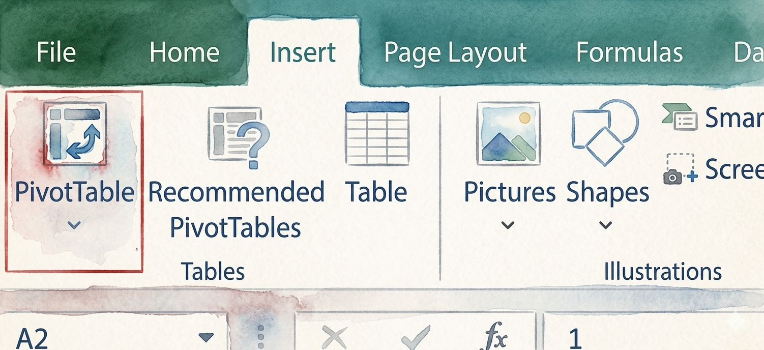
- Insert a PivotTable: Select your dataset, go to the Insert tab in Excel, and click PivotTable to create a new table from your data.
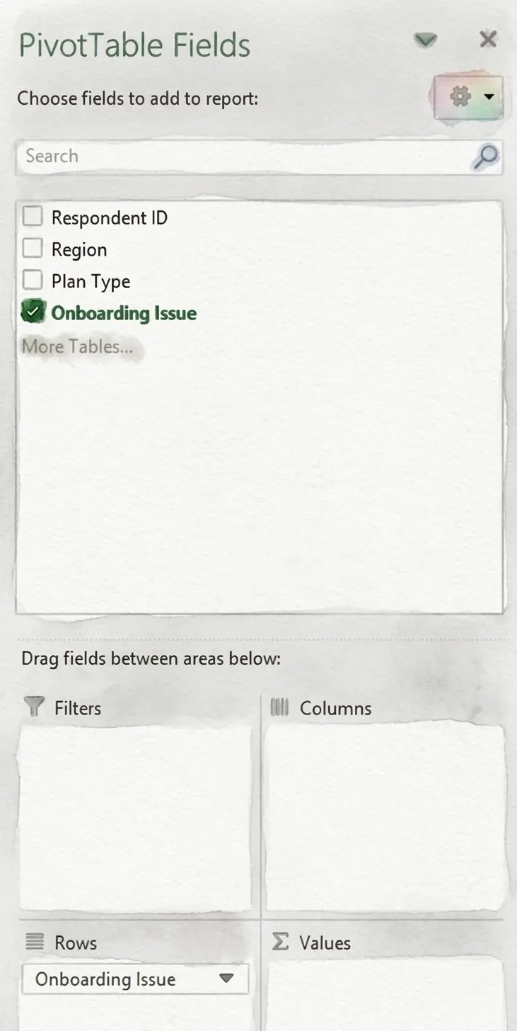
- Assign the row variable: Drag the variable you want to analyze (such as the onboarding issue mentioned) into the Rows field in the PivotTable Fields panel.
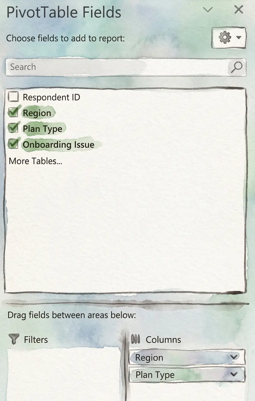
- Assign the column variable: Drag the grouping variable (such as region or plan type) into the Columns field.
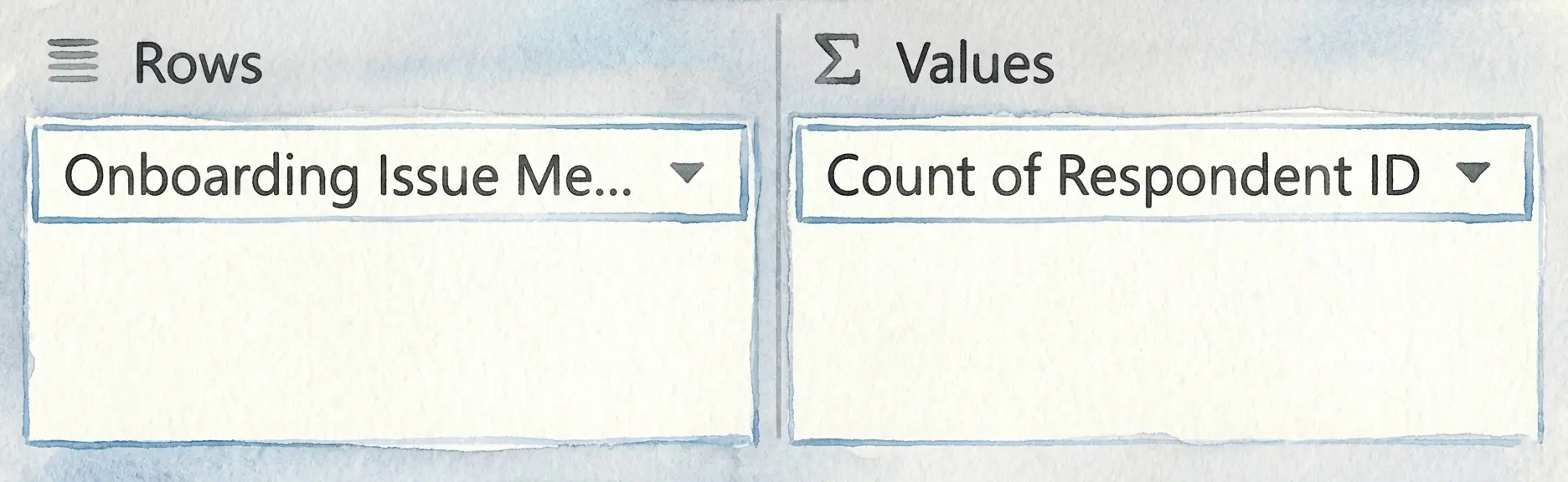
- View frequency counts across categories: Drag a field such as Respondent ID into the Values area and set it to Count to display how often each issue appears across different groups.
We now have a PivotTable that looks something like this. If you look at the overall results in the Grand Total column, Too Many Workout Options appears to be the most commonly reported onboarding issue, mentioned by 43.50% of respondents. This might initially suggest that users are primarily overwhelmed by the number of available workout choices during onboarding.
However, when the feedback is segmented by region and plan type, a different pattern begins to emerge. Among Free users in the East, Navigation Confusion is reported far more frequently (54%) than Too Many Workout Options (24%). A similar trend appears among Free users in the West, where Navigation Confusion is mentioned by 46% of respondents compared to 31% for Too Many Workout Options.
This may indicate that while the overall sample points to content volume as the primary concern, certain user segments, particularly Free-tier users in the East and West, may be struggling more with navigating the onboarding experience itself. Without crosstabulation, these segment-level usability challenges may remain hidden within the overall results.
Quantifying open ended feedback for cross tabs?
Using Chi Square Analysis With Cross Tabs
A crosstab can help you find patterns between different groups in your data, but it cannot tell you whether those patterns are meaningful or simply due to chance. This is where chi-square analysis comes in.
What is Chi-Square Analysis?
Chi-square analysis is a statistical test used to determine whether there is a meaningful association between two variables. In other words, it helps you understand whether the differences you see in a crosstab are likely to reflect a real relationship or if they may have occurred randomly.
Chi-Square Analysis Example
Let’s imagine a music streaming platform that wants to understand why users cancel their subscriptions.
After coding open-ended cancellation feedback into themes such as Price, Content Variety, or Technical Issues, the research team creates a crosstab comparing cancellation reasons across subscription plans to identify differences between user cohorts:
- Variable 1: Cancellation reason (price, content variety, technical issues)
- Variable 2: Subscription plan (free trial, standard, premium)
The crosstab results show that cancellations related to content variety differ by subscription plan: 46% of Premium users cancelled due to content variety while only 18% of Free trial users canceled for that reason.
To test whether this difference is meaningful, the research team applied a chi-square test using statistical software such as Excel, SPSS, R, or Python.
In most cases, you can simply input the crosstab data into the software and select the chi-square test option to analyze the relationship between cancellation reason and subscription plan.
The test returns a chi-square value showing how large the difference is between the groups, along with a p-value that indicates whether the difference between groups is statistically significant rather than just due to chance.
In our case, since the p-value is lower than 0.05, it suggests that the relationship between cancellations related to content variety and subscription plan is statistically significant. In simple terms, Premium users are significantly more likely than Free Trial users to mention content variety when they cancel.
That doesn’t prove that being on a Premium plan causes concerns about content variety. It simply shows that these two factors are meaningfully associated.
For the team, that can be a valuable signal. It may be worth taking a closer look at whether Premium users feel that the available content justifies the higher subscription cost, or if adjustments to content offerings or messaging could help reduce churn.
Applying Cross Tabulation to Qualitative Data
In many research projects, some of the most useful insights come from open-ended responses.
Cross-tabbing works great with structured data. If respondents select options from a list, comparing answers across age groups, plans, or regions is straightforward.
Open-ended feedback is different. When customers write in their own words, there’s no built-in structure. Before you can run a single crosstab, the data has to be interpreted, categorized, and standardized.
Manual qualitative coding of open ended responses is usually tedious and time consuming, and As a result, many teams avoid analyzing this data across segments and, in most cases, simply skim the responses or pull a handful of quotes to use in a PowerPoint presentation.
This is where ai tools for analyzing open ended survey data like Blix can make a big difference.
Quantifying qualitative feedback for cross tabs?
How Blix Helps Teams Cross-Tab Open-Ended Feedback Faster
Blix is an AI powered open-ends coding and analysis software that helps researchers quantify open ended data in minutes, to enable quantitative analysis of open ended textual feedback.
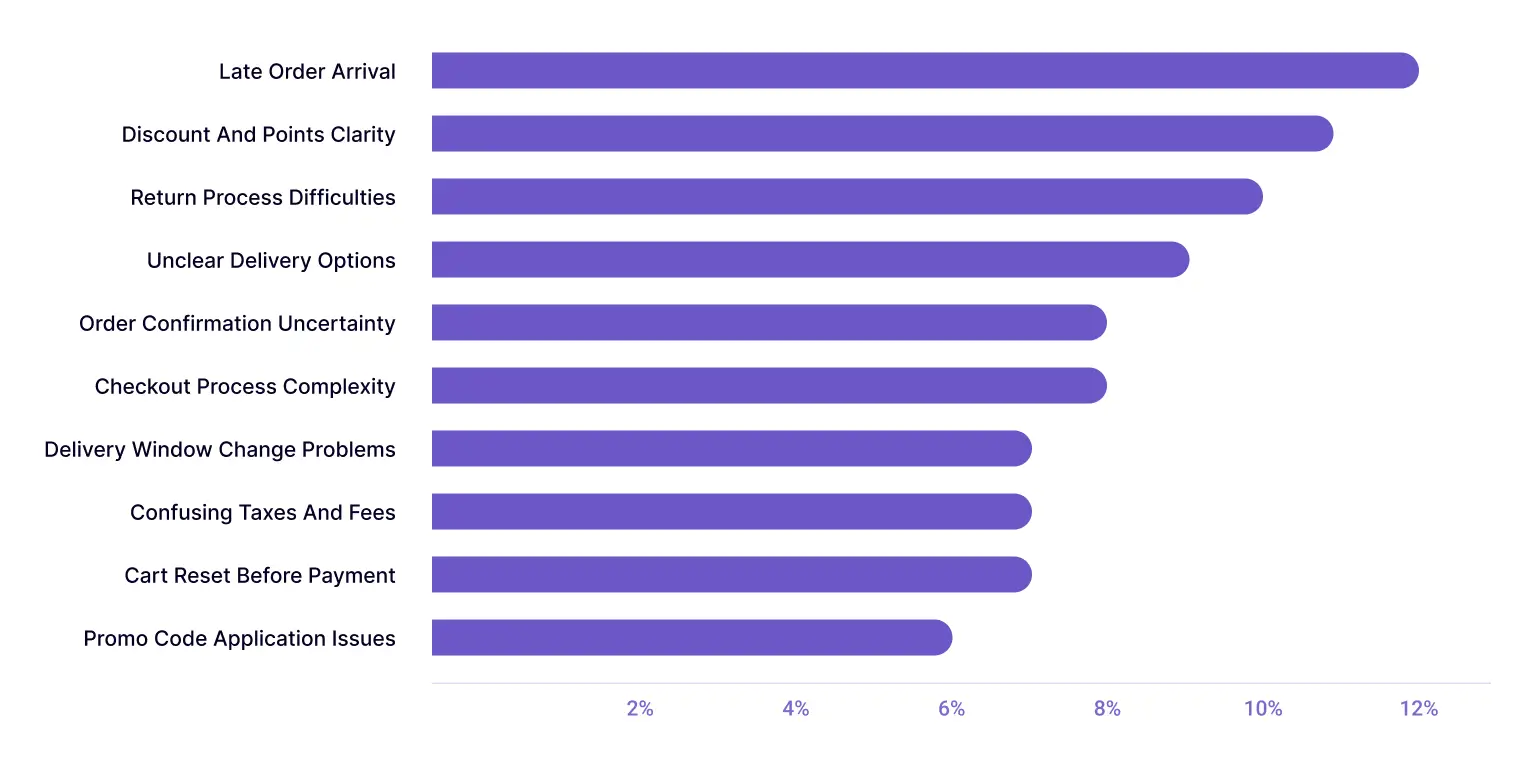
To illustrate, let’s say a retail company collects open-ended feedback from hundreds of new customers during the account setup and first purchase process. Some respondents mention difficulty applying promo codes, others note unclear delivery options, while some report confusion around loyalty rewards or return policies.
Because this feedback is collected in open-text form, the research team must first group similar responses into themes, such as Promo Code Application Issues, Unclear Delivery Options, or Return Process Difficulties, before comparing how these onboarding challenges differ across membership tiers, regions, or shopping channels.
Blix speeds up this process by automatically generating themes from open-ended survey responses in one click.
Here’s what the report would look like:
Once this feedback is categorized, it becomes structured data in excel that can be cross-tabulated easily.
The team can then compare how often each issue is mentioned by different customer groups to understand whether certain onboarding problems are more common among trial users versus paid subscribers or in one region versus another.
This PivotTable compares onboarding feedback themes across membership tiers by showing the percentage of users in each group who mentioned a given issue.
Delivery-related challenges, such as Late Order Arrival (17%) and Delivery Window Change Problems (14%), appear more frequently among Premium users. In contrast, Guest users are more likely to report checkout-related issues, such as Checkout Process Complexity (14%) and Order Confirmation Uncertainty (14%).
This suggests that onboarding friction points may vary by membership level, with Premium users encountering more delivery-related issues and Guest users struggling more with checkout usability.
By automatically organizing open-ended feedback into themes in minutes, Blix can let your team run crosstab analyses quickly and uncover insights across customer segments, without the burden of manual coding.
Try Blix and start cross-tabbing open-ended feedback in minutes


