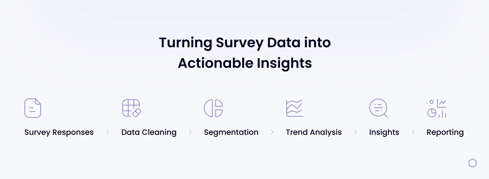
You’ve collected hundreds (or even thousands) of survey responses. Instead of clarity, you’re staring at rows of raw data that feel overwhelming to interpret. It’s not always obvious where to start, which insights actually matter, or how to choose a survey data analysis approach that won’t break once the dataset grows.
This guide walks through survey data analysis step by step. It covers how to work with different types of survey data along with practical guidance on presenting results clearly and avoiding common analysis mistakes. You’ll also learn how modern, AI-assisted platforms support faster, more consistent analysis of survey responses at scale.
What Is Survey Data Analysis?
Survey data analysis is the process of organizing and examining survey responses to identify trends and relationships in the data. The purpose is to move beyond raw results, like spreadsheets of ratings or pages of open-ended comments, and translate them into clear findings that answer your research questions.
In other words, survey analysis turns responses into insights you can act on, whether that means prioritizing product changes, improving customer experience, or identifying early warning signs like churn risk.
The Types of Survey Data You May Analyze
Survey data typically falls into a few core categories. To make this easier to visualize, imagine you’re analyzing a post-purchase customer satisfaction survey for a software product. Here are the types of survey data:
- Quantitative data: Numeric responses that can be measured and summarized using statistics such as averages, percentages, and trends. For example, customers rate their overall satisfaction on a scale from 1 to 10, allowing you to calculate average satisfaction scores and track changes over time.
- Qualitative data: Open-ended, text-based responses that explain opinions, reasoning, or experiences in a customer’s own words. For instance, customers answer, “What’s the main reason for your rating?” providing written feedback about usability, features, or support.
- Ordinal data: Ranked or ordered responses where the distance between values isn’t equal. To illustrate, customers select how satisfied they feel using options like Very satisfied, Somewhat satisfied, Neutral, Somewhat dissatisfied, or Very dissatisfied.
- Nominal data: Categorical responses with no natural order, used to group or segment respondents. For example, customers select their role (Marketer, Product Manager, Executive) or company size (Small, Mid-market, Enterprise).
- Binary data: Questions with two possible responses, such as yes/no or true/false. For instance, customers answer whether they would recommend the product to a colleague: Yes or No.
Step-by-Step: How to Analyze Survey Data
Here’s a practical workflow you can follow from survey conception through final reporting.
- Plan the analysis before launch: Start with the decisions this survey needs to support. Define your primary goal, what “success” looks like, and the key questions you need the data to answer (e.g., What’s driving low satisfaction after purchase?).
- Gather and centralize responses: Export results from your survey tool and combine everything into one source (such as Excel or Google Sheets). If you ran the survey across multiple channels (email + in-app, for example), bring the data together so you’re not comparing incomplete datasets.
- Clean the data: Remove duplicates, handle missing responses, standardize formats (such as dates or rating scales), and flag low-quality entries (like gibberish open-ends). This prevents small issues from skewing your results.
- Validate the survey setup: Confirm the survey logic and structure worked as intended. Review the question order and answer choices to check for anything that may have influenced how people responded. Also confirm that rating scales were used consistently, so responses can be compared accurately across questions.
- Segment the data with cross-tabulation: Break results into meaningful groups and compare them side by side. For a software post-purchase survey, that might mean comparing satisfaction by plan type, customer role, company size, use case, or onboarding completion.
- Analyze trends over time: Look for changes across time periods (weeks, months, or quarters). This helps you spot whether product updates, pricing changes, or onboarding adjustments are improving sentiment or creating new friction.
- Identify drivers and key relationships: Find what is most strongly associated with your main outcome (like overall satisfaction, renewal intent, or likelihood to recommend). For example, you might discover that low satisfaction clusters around onboarding confusion, missing features, or slow support response times.
- Present survey results clearly: Translate findings into a story stakeholders can act on: what you learned, what it means, and what to do next. Use a few key charts, call out the most important segments, and include representative quotes to add context (see more below).
Ready to analyze your survey data faster?
How To Present Survey Results
When presenting survey results, you have to make sure insights are easy to understand and act on. The steps below outline a simple, structured way to turn survey findings into clear visuals and explanations that help stakeholders quickly grasp what the data shows and what to do next.
1. Select the Right Format for Your Audience
Start by deciding how results will be shared. A slide deck works well for internal reviews and leadership updates, where the goal is to highlight key findings and decisions. A written report or case study is better for deeper documentation, research sharing, or external audiences. Choose the format that fits how the results will be used.
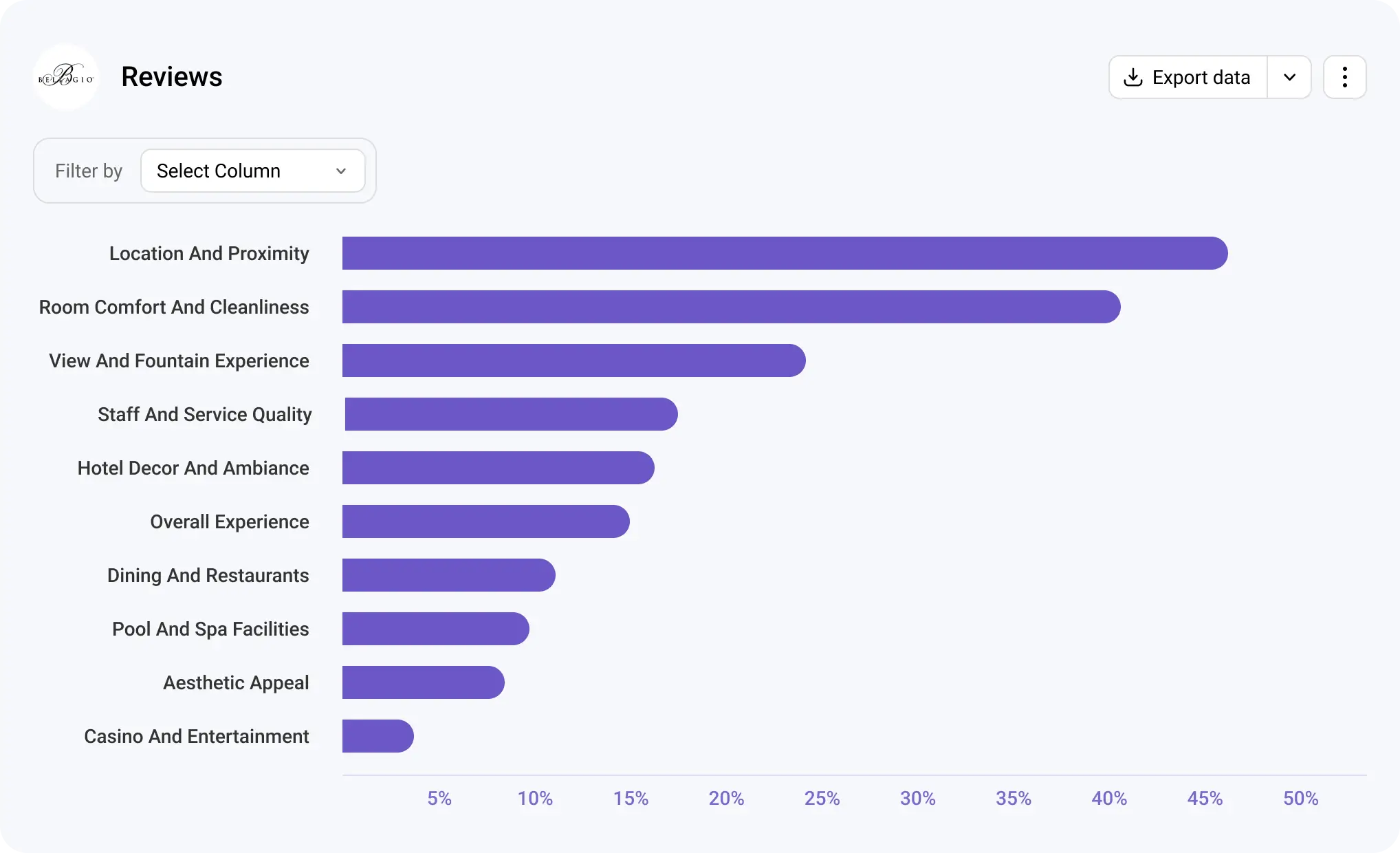
2. Build Visuals That Show Relationships and Patterns
Visuals help make complex data understandable. Use bar charts to compare groups, line charts to show changes over time, and stacked bars for rating-scale questions. Each visual should support a specific question, not just display data.
3. Explain What the Data Means in Plain Language
Pair every chart or table with a short explanation that summarizes the insight. Focus on what changed, where differences appear, and why it matters. Avoid restating numbers and instead highlight the implication behind them.
4. Connect Findings to Actions and Context
Close by summarizing the most important takeaways and outlining recommended next steps, such as prioritizing specific product improvements, adjusting onboarding or support workflows, or running a follow-up survey to explore an issue in more detail. Supporting insights with a few relevant examples of key findings adds context and helps stakeholders understand the “why” behind the numbers.
Tips for Analyzing Survey Data Effectively
These tips help keep your analysis focused, accurate, and easy to translate into meaningful insights:
- Start with the question you’re trying to answer: Anchor your analysis around a clear research question so you don’t get distracted by metrics that aren’t tied to a decision or outcome.
- Check sample size before comparing groups: Make sure each segment has enough responses to support reliable comparisons and avoid drawing conclusions from very small samples.
- Keep time periods consistent: Compare results across the same time windows to avoid misleading trends caused by seasonality or uneven data collection.
- Segment intentionally, not excessively: Break data into meaningful groups that support your analysis goals, rather than creating so many segments that patterns become unclear.
- Document assumptions and limitations: Note any constraints in the data, such as missing responses or survey design choices, so results are interpreted in the right context.
- Translate metrics into clear takeaways: Move beyond reporting numbers by explaining what the results mean and how they should inform next steps or decisions.
Common Mistakes in Analyzing Data and How To Avoid Them
Even well-designed surveys can lead to misleading conclusions if results aren’t analyzed carefully. The mistakes below are common across research teams, but with the right approach, they’re also avoidable.
Confusing Correlation With Causation
One of the most common analysis mistakes is assuming that when two variables change at the same time, one is automatically responsible for the other. Survey data often reveals patterns, but patterns alone don’t explain why something is happening.
Example: Customers who report lower satisfaction also mention onboarding challenges. While this suggests a relationship, it doesn’t prove onboarding issues are the root cause; other factors like missing features or pricing expectations may also be influencing satisfaction.
How to avoid it: Treat correlations as signals, not conclusions. Use follow-up questions, segmentation, or additional analysis to test whether a factor consistently influences the outcome across different groups or time periods.
Drawing Conclusions From Small Sample Sizes
Insights based on very small groups of respondents can be misleading and unstable. When sample sizes are too small, individual responses can disproportionately influence results.
Example: A post-purchase survey shows negative feedback from enterprise customers, but only six enterprise users responded. Those responses may not represent the broader enterprise customer base.
How to avoid it: Check sample size before comparing segments, and avoid making definitive claims when data is limited.
Relying on Averages Alone
Averages provide a helpful summary, but they can hide meaningful differences within your data. Focusing only on overall scores can mask segment-specific issues that matter more than the headline number.
Example: An average satisfaction score of 7 suggests acceptable performance, but a closer look shows new customers rating the product much lower than long-term users.
How to avoid it: Pair averages with segmentation, distributions, or cross-tab analysis to understand how different groups are experiencing the product or service.
Tracking Metrics Without Clear KPIs
Analyzing data without a defined goal often leads to reporting metrics that don’t support decision-making. When teams track everything, it becomes harder to focus on what actually drives outcomes.
Example: A report highlights sentiment trends and engagement scores but doesn’t connect them to renewal rates, churn, or adoption goals.
How to avoid it: Start analysis by defining the key outcome you’re trying to influence, then focus on the metrics that explain or impact that result.
Avoid these survey analysis mistakes.
Analyze open-ended responses with AI-driven software built for scale.
Closed-Ended vs. Open-Ended Survey Data Analysis
Closed-ended and open-ended survey questions serve different purposes, and as a result, they require different analysis approaches. Closed-ended questions provide predefined answer options, while open-ended questions capture context, reasoning, and nuance in respondents’ own words. The key differences and similarities include:
- Type of data collected: Closed-ended questions produce structured, numeric, or categorical data (ratings, multiple choice, yes/no), while open-ended questions generate unstructured text responses.
- Analysis methods: Closed-ended data is analyzed using summaries like percentages, averages, distributions, and cross-tabulations. Open-ended data requires coding, categorization, or thematic analysis to identify patterns.
- Speed and scalability: Closed-ended analysis is typically faster and easier to scale because responses are already structured. Open-ended analysis may take more time, especially as response volume grows.
- Depth of insight: Closed-ended questions are effective for measuring what is happening and how often. Open-ended questions explain why it’s happening by capturing opinions, motivations, and experiences.
- How they work together: Closed-ended data highlights trends and outliers, while open-ended data adds context that helps explain those results. Used together, they provide a more complete view of survey findings.
Still coding open-ends manually?
Book a demo now.
How To Choose the Best Survey Data Analysis Software
When comparing survey analysis tools, asking the right questions helps you look past feature lists and focus on what will actually support your research workflow. Use the questions below to guide your evaluation.
- Is the tool easy to use for my team? Consider how quickly researchers can get started without extensive training and whether the interface supports everyday analysis tasks.
- How does the tool handle automation and AI-assisted analysis? Look at how automation reduces manual work, such as coding open-ended responses or summarizing results.
- How quickly can I get meaningful insights from the data? Evaluate how easily the tool surfaces trends, patterns, and key drivers without requiring complex setup or technical expertise.
- Does the tool meet security and privacy requirements? Check whether it provides appropriate data protection, access controls, and compliance measures for handling sensitive survey data.
- Will the pricing work as my team and data grow? Think about whether the cost scales reasonably with more users, higher response volumes, or more frequent surveys over time.
Common Mistakes To Avoid When Selecting Software
Choosing the wrong survey analysis tool can slow research teams down and limit the value of the data they collect. The mistakes below are common when teams focus on features instead of long-term usability and scalability:
- Choosing feature-heavy tools that are difficult to adopt: Tools packed with advanced features may look powerful but often require significant training or technical expertise. When teams struggle to use the software effectively, they revert to manual processes or underuse the tool’s capabilities.
- Failing to plan for growth in response volume or survey frequency: A tool that works well for small surveys may not hold up as response volumes increase or surveys run more frequently. This can lead to performance issues, higher costs, or the need to switch platforms later.
- Underestimating onboarding time and effort: Even strong tools can fall short if teams aren’t properly onboarded. Long setup times, unclear workflows, or limited support can delay analysis and reduce adoption across teams.
What Statistical Tool To Use for Survey Data?
A statistical tool is any software or system used to organize, summarize, and analyze survey responses so patterns and relationships become easier to interpret.
There are several options available for analyzing survey data, depending on complexity and scale. Spreadsheets like Excel or Google Sheets are commonly used for basic summaries and charts. Statistical software such as R, SPSS, or Python-based tools supports more advanced analysis, including modeling and hypothesis testing.
However, many modern surveys include both numeric responses and written feedback. For example, a customer may rate their satisfaction as 7 out of 10 and then explain why they chose that rating in a text response. While traditional statistical tools handle the numeric score easily, they struggle to efficiently analyze the written explanations at scale.
As surveys increasingly combine quantitative questions with rich text feedback, many teams find they need tools designed specifically for survey analysis to handle both data types together and extract insights consistently.
How Blix Streamlines Open-Ended Survey Data Analysis
While analyzing numeric data scales well with tools like Excel or statistical analysis software, coding open-ended responses remains a largely manual and time-consuming task. Blix helps automate this part of the process with AI-powered open-ended analysis, allowing teams to analyze qualitative feedback at scale and confidently include open-ended questions in their surveys without hesitation.
Key Features of Blix That Support Faster, High-Quality OE Analysis
Blix is a purpose-built survey analysis platform designed to make open-ended analysis more efficient with these features:
- AI-native analysis: Instantly generate insights with one click using advanced large language models trained to interpret open-ended responses at scale.
- Minimal manual effort: Reduce the need for time-consuming hand coding so teams can focus on interpreting insights.
- Consistent coding across datasets: Apply the same logic and structure across large volumes of responses, helping maintain consistency and reduce analyst bias.
- Simple review and adjustment: Quickly review generated themes or categories and make edits as needed to align results with research goals.
- Clear reporting outputs: Produce structured results that are easy to share in presentations, reports, or dashboards without additional formatting work.
- User-friendly interface: Work within a clean, easy-to-use interface that is intuitive even for new users.
Use Cases
Blix’s AI-powered open-ended survey analysis platform is useful across teams that need to understand large volumes of feedback without relying on manual coding. The use cases below highlight how different teams apply these insights in practice.
- Research teams conducting discovery research: Market research teams use open-ended analysis to synthesize themes, patterns, and unmet needs from exploratory surveys, helping inform strategy, positioning, and future research directions.
- Product teams analyzing feature feedback at scale: Product teams analyze written feedback from users to identify recurring feature requests, usability issues, and areas for improvement across large user bases.
- Customer experience teams identifying drivers of satisfaction or churn: CX teams use open-ended responses to uncover what influences customer satisfaction, loyalty, or churn, enabling more targeted improvements to support and service workflows.
Ready to analyze survey feedback faster and get high-quality insights?
Blix helps teams analyze open-ended survey responses at scale without manual coding or complex workflows. See how Blix fits into your research process and turns survey feedback into clear, usable insights with a free demo.
Human level quality, done in minutes.
Blix makes open-ends coding quick, accurate and refreshingly easy.
Book a demo now to check it out.
FAQ
Here are answers to common questions about survey data analysis.
The four main types are:
- Descriptive (what happened)
- Diagnostic (why it happened)
- Predictive (what may happen next)
- Prescriptive (what actions to take).
Most survey analysis focuses on descriptive analysis, with diagnostic analysis used to explain key drivers.
Heading 1
Subscript
Heading 2
Superscript
Heading 3
Emphasis
Heading 4
Bold text
Heading 5
Heading 6
- Item A
- Item B
- Item C
Lorem ipsum dolor sit amet, consectetur adipiscing elit, sed do eiusmod tempor incididunt ut labore et dolore magna aliqua. Ut enim ad minim veniam, quis nostrud exercitation ullamco laboris nisi ut aliquip ex ea commodo consequat. Duis aute irure dolor in reprehenderit in voluptate velit esse cillum dolore eu fugiat nulla pariatur.
Unordered list
Block quote
- Item 1
- Item 2
- Item 3
Ordered list
Yes, Excel works well for basic summaries, percentages, charts, and simple comparisons. However, it becomes difficult to manage with large datasets, frequent surveys, or open-ended text responses, which often require more specialized tools.
ChatGPT may help explore survey data, summarize responses, or brainstorm themes. However, purpose-built survey analysis software offers more consistency, transparency, and scalability for research-grade analysis.
Timelines vary based on dataset size, survey complexity, and analysis depth. Manual analysis can take days or weeks, while software-assisted workflows can significantly reduce time by automating repetitive tasks. For example, Blix generates insights from open-ended survey responses within minutes.
Descriptive statistics, such as percentages, averages, medians, and distributions, are used most often. These methods summarize large volumes of responses clearly without requiring advanced modeling.
Manual verbatim coding becomes inefficient and inconsistent as response volume grows. Software-based analysis platforms, such as Blix, support scalable qualitative analysis by automatically organizing, categorizing, and summarizing text responses across large datasets.


